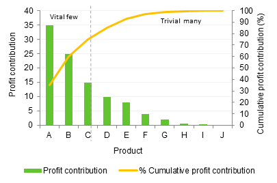
Pareto Analysis is a statistical technique for decision making that is used for selecting a number of tasks that produce significant overall effect.1 It is based on the Pareto Principle (the 80/20 rule) which states that by doing 20% of the work you can generate 80% of the benefit of doing the whole job. The Pareto Analysis is named after Vilfredo Pareto, an Italian economist who lived in the late 19th and early 20th centuries. In 1897, he presented a formula that showed that income was distributed unevenly, with about 80% of the wealth in the hands of about 20% of the people.2
The figures 80 and 20 are illustrative; the Pareto Principle illustrates the lack of symmetry that often appears between work put in and results achieved. For example, 13% of work could generate 87% of returns. Or 70% of problems could be resolved by dealing with 30% of the causes. The sum of the two numbers does not need to add up to 100 all the time.
The following conclusions are illustrative of potential Pareto outcomes2:
- 80% of customer complaints arise from 20% of your products or services.
- 80% of delays in schedule arise from 20% of the possible causes of the delays.
- 20% of your products or services account for 80% of your profit.
- 20% of your sales-force produces 80% of your company revenues.
- 20% of a system’s defects cause 80% of its problems.
Applications and benefits of Pareto analysis1, 2, 3, 4
The 80/20 rule can be applied to almost anything within a business. Representing your key business data in a simple Pareto Chart and identifying the “vital few” will help you to define the areas where to primarily focus (or not) time and resources of your organization. The Pareto Analysis can be used as a decision making tool when deciding where the business should prioritise their focus and resources. It can also be used together with other problem solving tools, such as root-cause-analysis and check sheets, to analyse the impact of different problems and hence decide which problems to tackle first. Here are some of the benefits for the Pareto analysis:
- Efficiently solves a problem by identifying and prioritising the main causes of faults by identifying the few problems that cause the biggest impact.
- Sets the priorities for many practical applications. Some examples are: process improvement efforts for increased unit readiness, customer needs, suppliers, investment opportunities.
- Shows where to focus time and effort by identifying the work areas that will provide 80% of the require result.
- Allows better use of limited resources.
How to construct a Pareto diagram1
The Pareto diagram/chart is similar to the histogram or bar chart, except that the bars are arranged in decreasing order from left to right according to their importance. The steps involved in constructing the Pareto diagram are as follows:
- Step 1 – Record the raw data. List each category and its associated data count.
- Step 2 – Order the data. Prepare an analysis sheet, putting the categories in order and placing the one with the largest count first.
- Step 3 – Label the left-hand vertical axis. Make sure the labels are spaced in equal intervals from 0 to a round number equal to or just larger than the total of all counts. Provide a caption to describe the unit of measurement being used.
- Step 4 – Label the horizontal axis. Make the widths of all of the bars the same and label the categories from largest to smallest.
- Step 5 – Plot a bar for each category. The height of each bar should equal the count for that category. The widths of the bars should be identical.
- Step 6 – Find the cumulative counts. Each category’s cumulative count is the count for that category added to the counts for all larger categories.
- Step 7 – Add a cumulative line.
- Step 8 – Draw a line at 80% on y-axis parallel to x-axis. Then drop the line at the point of intersection with the curve on the x-axis. This point on the x-axis separates the vital few on the left and the trivial few on the right.
Source 1 Anonymous – “Pareto Analysis” – http://www.improhealth.org/fileadmin/Documents/Improvement_Tools/Pareto_Analysis.pdf – Accessed 25th April 2014
2 Haughey,D – “Pareto Analysis step by step” – http://www.projectsmart.co.uk/pdf/pareto-analysis-step-by-step.pdf – Accessed 20140425
3 van Assen, M, van der Berg, G , Pietersma, P – ”Key management models; The 60+ models every manager should know – 2nd edition – FT Prentice hall – 2009 – page 224-226
4 Leavengood S. and Reeb J. “Part 3: Pareto Analysis and cheek sheets” – http://owic.oregonstate.edu/sites/default/files/pubs/EM8771.pdf_ Oregon State University – 2002 – Accessed 25th April 2014


